 Previous Entry
|
Uploaded: 3/24/2009 2:54:51 PM Categories: Built Work Elevations Floor Plans Sketches Variations |
Perde House
What separates a good home designer from the less savvy is their ability to create a home that provides more than just shelter conforming to neighborhood restrictions. Those who live in such subdivisions usually want a spacious home that has a look and feel they think their neighbors and visitors will appreciate. Sometimes the need to meet this goal results in people duplicating a building they had seen somewhere else, without considering their own unique needs and dictates of their property. The Perde family contacted me with the intent of rebuilding the Mindrut house on their property, which was a few lots down from the Mindruts home. Clearly the neighborhood review board would not allow that to happen. So, once the Perdes were convinced not to rebuild someone elses house, we were able to begin designing a house for them. The Perde house presents a quiet elevation with classic details indicative of an upstanding southern family. Inside the house is a well coordinated space that takes full advantage of the fenestration patterns called for in this kind of design scheme. In this project, the uniformity of the window/door placement grid was used as a catalyst for an interior that plays between these orienting lines.
At the heart of the design problem was a conflict in proportion. The homeowner, for whatever reason, wanted a house with three uniform bays across the front elevation. However, the floor plan that was most accepting of the interior requirements called for by the client was a four bay system. A series of floor plans and elevations were provided to the owner and the governing neighborhood review board in order to resolve this problem. The final solution packaged a four bay style house into a three bay elevation by compressing the outside bays into efficient spaces under subordinate roof lines. With this design, the primary rooms of the house make comprise a large footprint in the home, reducing the amount of interior walls and ultimately freeing up a more pleasurable communal living space. Private spaces are pushed to the perimeter walls of the house further facilitating the open spaces at center.
The Perde house stands as a testament to the individuality of architecture, even when confronted with similar intentions and aesthetics. Copies are almost never the best solution. You can compare the Perde house to the Mindrut house by clicking here.  View:
all my houses View:
all my houses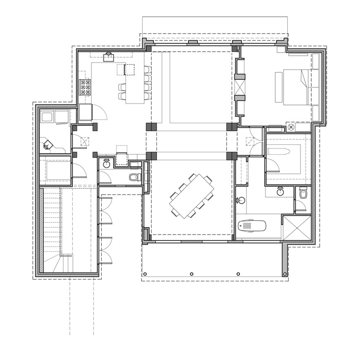
The first attempts to package the floor plan into a disharmonious exterior shell proved the inherent problem of such undertakings. 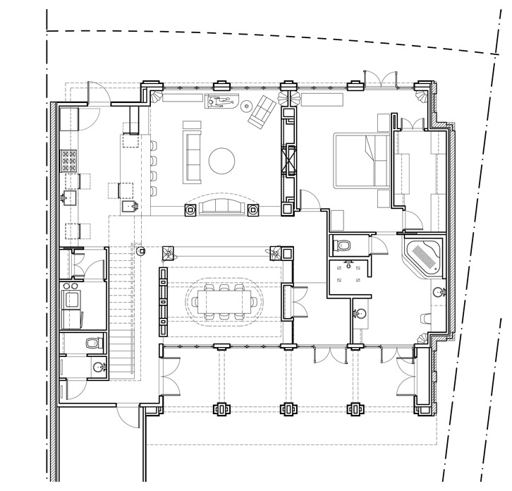
We tried using a four bay design scheme with different exterior articulation, but the neighborhood review board would not allow it. 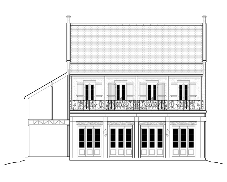
I thought the look and feel of the building was different from the Mindrut house in enough ways that the design would be accepted. 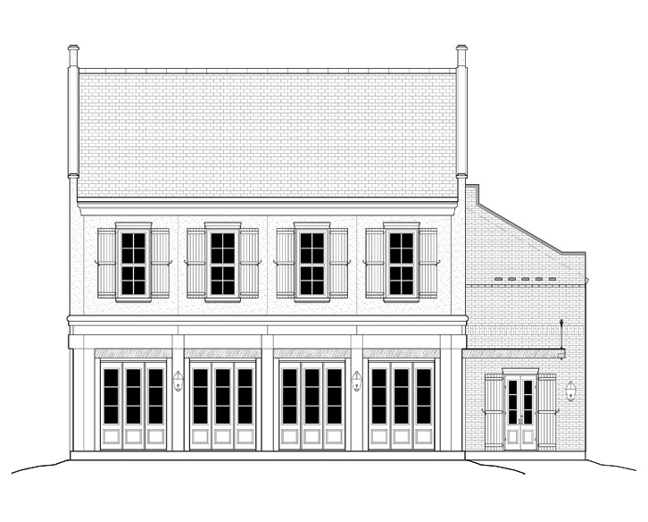
The rear elevation of the first proposed design shows a two-story version of a mixed-use building indicative of the subdivision requirements. 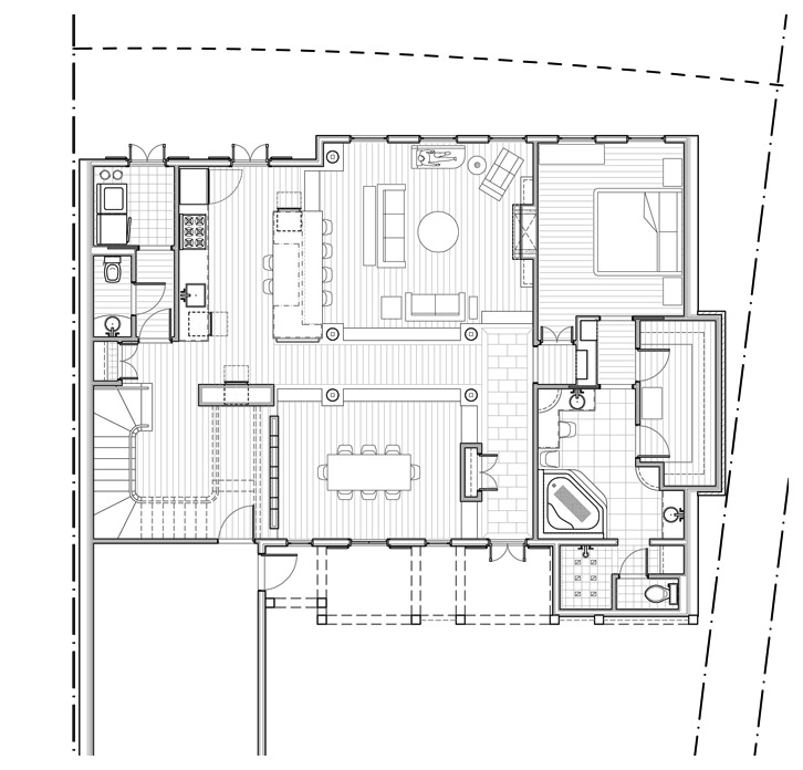
A hybrid bay system was pitched to the neighborhood board in order to make the master more appealing to the home owner, but was rejected. 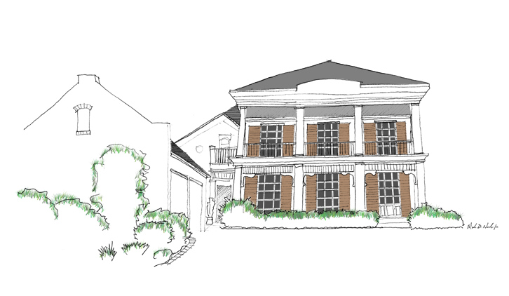
In an attempt to present a clearly conforming exterior, I made this sketch of a classic three bay home with attached wing leading to the garage. 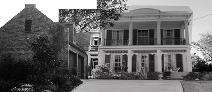
The above sketch was made over a collage of different buildings that best exhibited the stylistic motif desired by the neighborhood board. 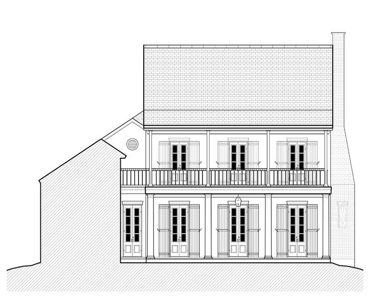
After reviewing the required design aesthetic called for by the neighborhood review board, the owner approved this elevation for final submission. 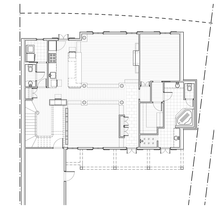
The final floor plan uses a set of interior columns to shift the planning grid to accommodate the space plan called for by the home owner. |
 Chalasani House